
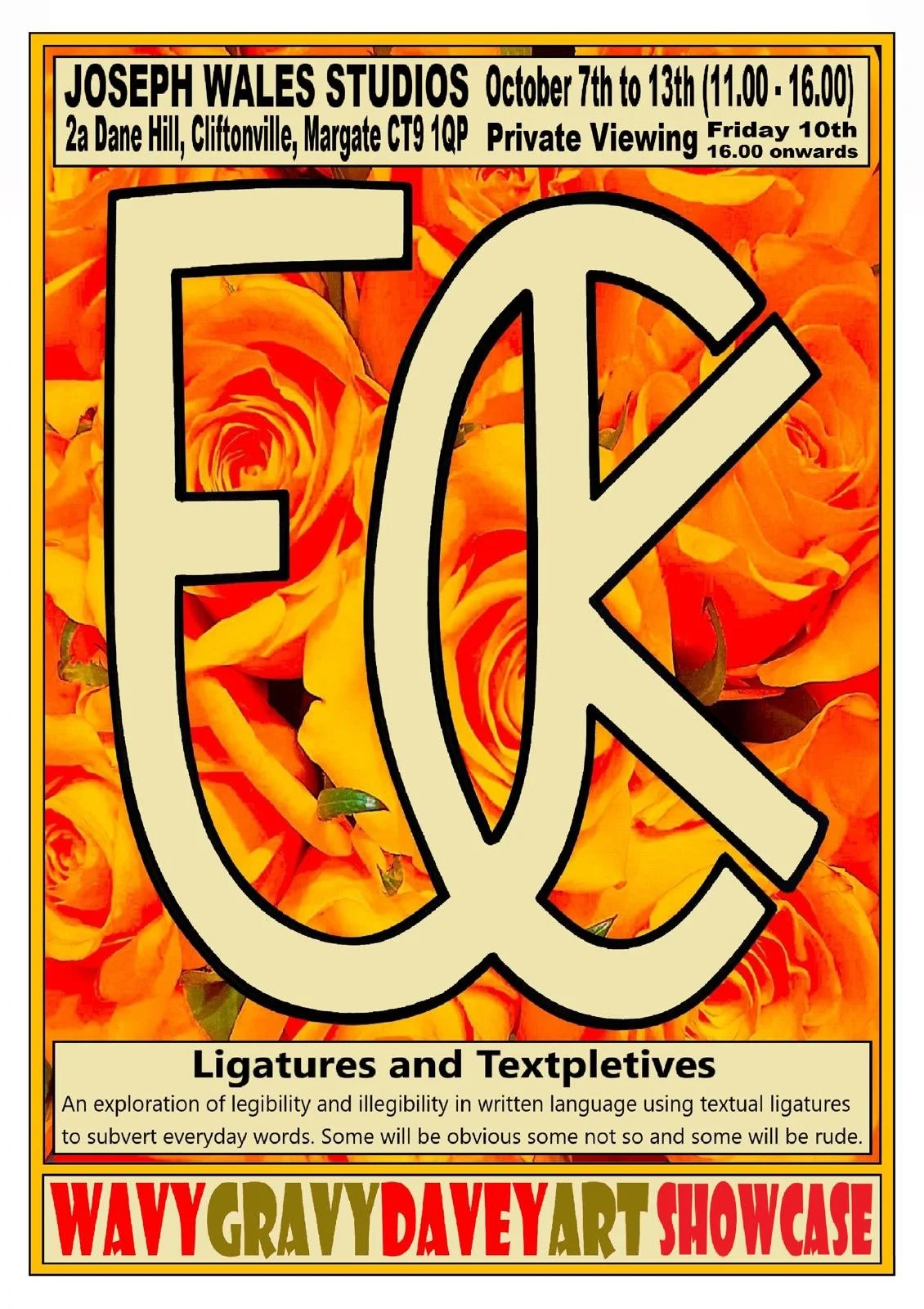
An exploration of legibility and illegibility in written language using textual ligatures to subvert everyday words. Some will be obvious, some not so, and some will be rude.
A ligature in graphic design refers to the combination of two or more characters into a single glyph or typographic unit. Ligatures are created to enhance the appearance and readability of text by replacing certain character combinations that may visually clash or create awkward spacing with a more aesthetically pleasing and harmonious alternative. Here are a few examples below:
I became fascinated with the idea of transforming complete words into ligatured words. Starting with swear words, combining crudity with beauty, I continued with more motivational words. Not always immediately readable, they show a unique typographical twist with word shapes. Some are more obvious than others.
Private view on Friday 10th, 4pm - 8pm
Socials:
Instagram: @wavygravydavey